You may have noticed that ThorCheck reports now include visualizations of the search data.
What are the numbers?
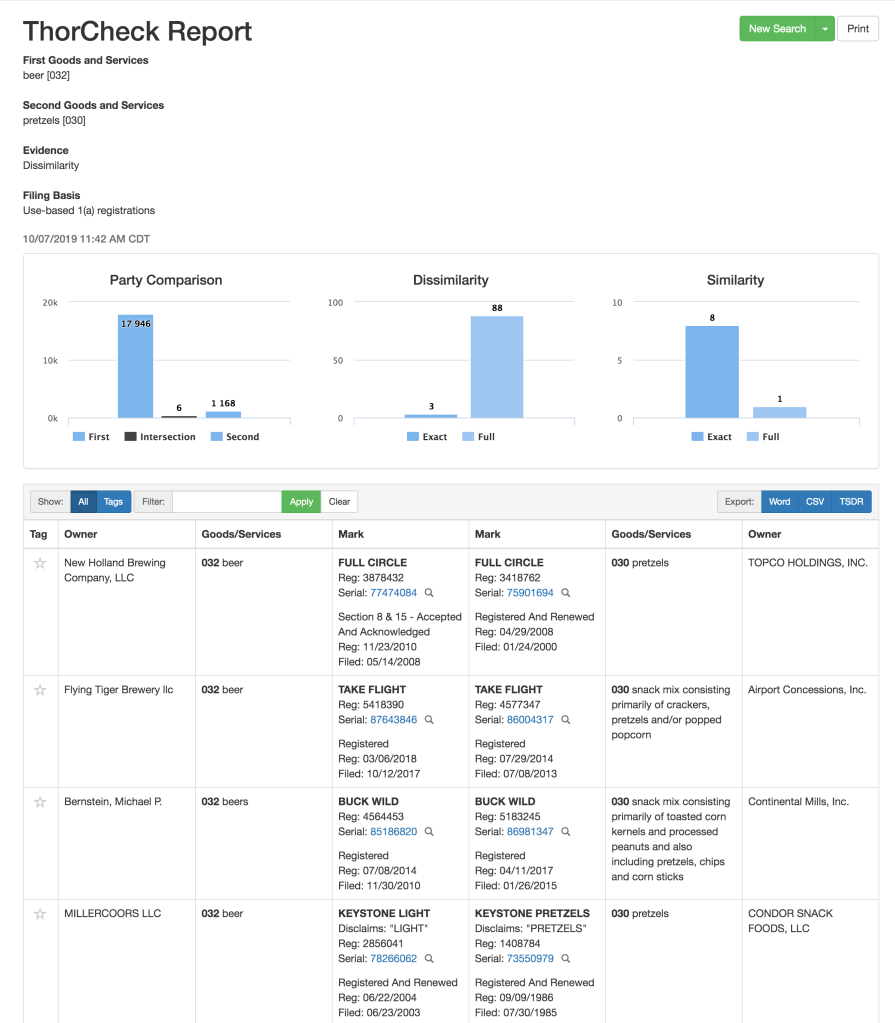
There are three graphs. The first has raw counts on how common the two sets of goods (beer vs. pretzels) are, and how much overlap they had (both sets of goods in a single registration). The second gives you counts of how many identical and highly similar marks with different owners there are, and the third gives you counts of how many identical and highly similar marks with the same owners there are, whether in a single registration certificate or different certificates.
How can you use the numbers?
The charts give you a high-level view of the extent of overlap (or lack thereof) between two sets of marks or two sets of goods or services. You can do a quick look to see if you have a reasonable set of arguments, or if the arguments you want to make are outweighed by the .
The table below the graphical analysis section contains all the comparative research examples that you’ve come to expect. In the screenshot below, you’ll see the first three marks are identical, matching the “3” as “Exact” in the “Dissimilarity” section, and then the similar-but-not-identical mark comparisons start, like KEYSTONE LIGHT (disclaiming “light”) vs KEYSTONE PRETZELS (disclaiming “pretzels”). These are the examples that you will use to support your arguments, and the evidence you will provide your Examiner or the Board.
By mixing the context that the charts provide with the anecdotal evidence from the table, you can build your strongest Office Action Response or dispute arguments, and help your clients succeed.