New 2026 Clearance Model! We thrilled to have our new 2026 clearance model live on production.
Setting the benchmark for clearance depth and clarity, you will see improved matching and prioritization of semantic meaning, spelling variations, abbreviations, translations, and more. You’ll get clear results that you can act on quickly, risk indicators, and more responsive watch results.
You also get powerful new filter options to help you slice and dice results to best focus on your key objectives, and industry breakouts of visualizations to help you better segment searches that cover multiple product areas.
Mark Neural Criteria. Simplify and improve custom criteria in field-based searches and watches with one mark field that leverages model-based similarity.
Domain Names. 300+ million records, all enabled for clearance, search, and watch.
Pharmaceuticals and Substances. Our house-mix dataset brings together pharmaceuticals, biologics, natural products, vitamins and dietary supplements, food and cosmetic ingredients, homeopathic substances, and pharmacopoeia references from dozens of sources. Reports include POCA scoring and nomenclature stems. Enabled for clearance, search, and watch.
Demand Letter Drafting. Building on the 2(d) Response Drafting tool, the new Demand Letter Drafting tool helps you quickly move from identifying a relevant result to generating a quality draft demand letter.
Design Common Law Returns. After a hiatus following Microsoft’s end-of-life of the Bing Search APIs, we’ve integrated Google Vision with similar capabilities.
Multi-Factor Authentication. Use your favorite authenticator app for an extra layer of protection for your account. SAML Single Sign-On is available as well for firms with an identity provider.
In Case You Missed It. If you haven’t taken full advantage of other recent enhancements, they include:
“Color” marks are a bit of an oddity for trademark professionals — a color or set of colors applied to a product, packaging, or the means of providing a service that has a source-indicating function rather than a merely decorative importance.
These are difficult to search for, even using advanced AI models — like our new AI search tool! You should try it; it’s awesome!, because the mark can be displayed in several ways that look very different from each other: (1) a color swatch or swatches, (2) a drawing of an object to which the color is applied, shown in color, and (3) a drawing of an object to which the color is applied, but with stippling serving as a “code” for the color, and (4) multiple views of (2) or (3) in a single filing. Furthermore, the various angles and ways the product in (2)-(4) could be displayed could end up looking fairly different but are still representing the same mark.
One significant complication is that the USPTO and most other trademark offices deal with color marks differently, from a data perspective. Many jurisdictions around the world include a data point, which we store in the “Feature Type” field for manual searches, that identifies color marks, sound marks, holograms, smells, etc. While this data coding isn’t perfect, and often has things tagged that actually aren’t true “color” marks, it’s still pretty good and very convenient. And then there’s the UPSTO, which… doesn’t.
Instead of a single, nice, clean variable, the USPTO jams indicators that identify “color” marks into its design coding system. This is actually one of the biggest ways the USPTO design codes differ from the Vienna design code system. In the Vienna system, codes starting with 29 are just color identifiers. The mark is a pig logo that has some pink in it? Great. 29.01.01. In the USPTO, it’s a lot more complicated — the pink in the pig may only show up as a part of the color claim and/or the mark description. Instead, the color-related design codes in section 29 replicate the “color” mark boolean that is much more efficiently conveyed in other jurisdictions. The tradeoff is that the USPTO provides a little more depth, with separate categories for (a) single-color and (b) multi-color marks, (b) used on the entire items or (c) just a part of it, and for those color marks (d) used on products or items used in providing for services and (d) used on packaging or (e) other advertising, and the various combinations of these three sets of values.
So, how do you do this in TM TKO? Let’s pretend that your client is a pharmaceutical manufacturer, and has asked if they can obtain protection for a “color” mark that is a bright yellow pill (or, if not, a yellow stripe on a pill). In the US: https://www.tmtko.com/searches/2938217 for yellow just on product, or https://www.tmtko.com/searches/2938215 for any yellow on products/packaging. Internationally, it’s simpler — something like https://www.tmtko.com/searches/2938219, for a similar yellow in the EU. (And, yes, I picked yellow because it’s relatively less common.)
We are excited to announce our new, machine-learning-driven image clearance tool. Just log in and go here to try it — we’d love to hear from you about your experiences. As with all of TM TKO’s tools, access is included in any subscription or day pass.
The new system is simple. Just drop in an image; you’ll be able to crop it if needed. If you want to add US and/or Vienna design codes (particularly helpful if you have a “busy” image with a lot of visual elements, but you are most interested in one feature in particular), you can do so. Hit search, and you’ll be off.
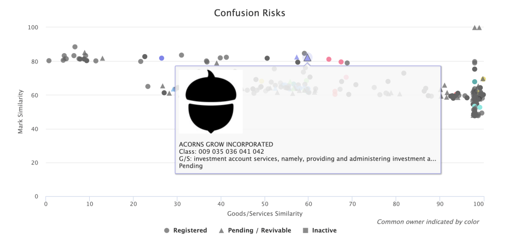
We replicated a search for a recent application for an acorn logo for insurance services here, so you can see it in action. The first two results are the filed-for mark and a co-pending application with the same owner. So far, so good. Another acorn design that was cited by the Examiner was the #4 result, with another, similar acorn in between.
As with TM TKO’s other clearance tools, your search report includes helpful visualizations of mark and goods similarity, helping you quickly triage risks and get an answer to your client both quickly and accurately.
If you choose to include common-law results, you will get an additional section of image results sourced from Bing.
We have been working on this for quite a while, and are very happy to have this out in the world for you to use! Watches and portfolio-driven watches will be available soon.
TM TKO now includes TTAB data! Just like with our Office Action research tools, thoroughness is the key – you aren’t just limited to final decisions. You can search through decisions, rulings, pleadings, motions, and more to hone in on strategies and arguments that have worked for others in situations similar to the one your client faces. You can now do vastly more complex research than the TTAB’s Reading Room decision-only search options allow.
TTAB proceeding research
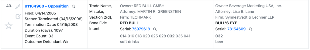
Track down proceedings that fit a fact pattern. It’s simple to find oppositions or cancellation actions where both parties’ marks include the term GREEN, or to find where a senior party making soda opposes an application for beer (representative sample shown below), or to identify strategic patterns in highly litigious counterparties.
TTAB document research
Find specific models to assist your drafting process and meet your needs. You can be done with adapting general model documents — it is now simple to find prior motions or briefs that address your key issue with TM TKO. You can do better, more efficient work.
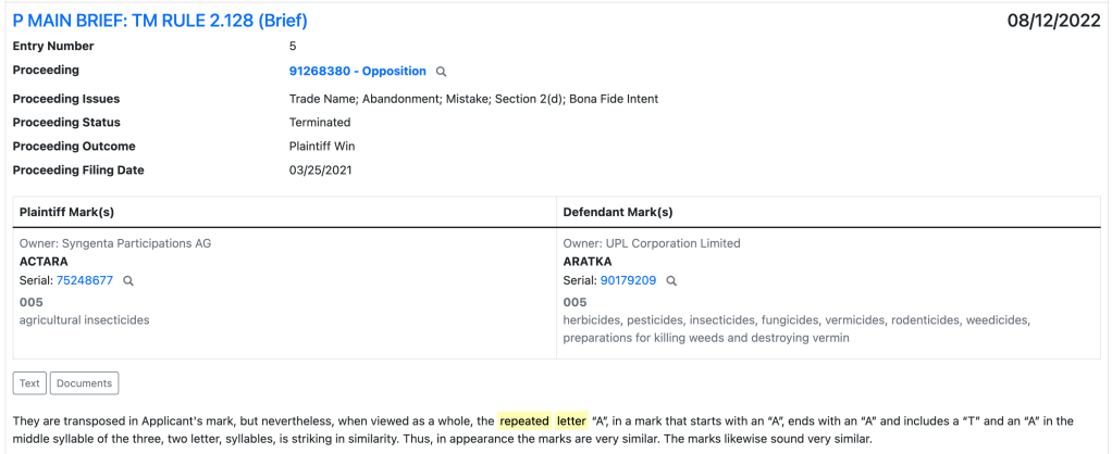
For example, if you’re searching for arguments about a “repeated letter,” you can track down similar arguments in seconds.
Appeal research
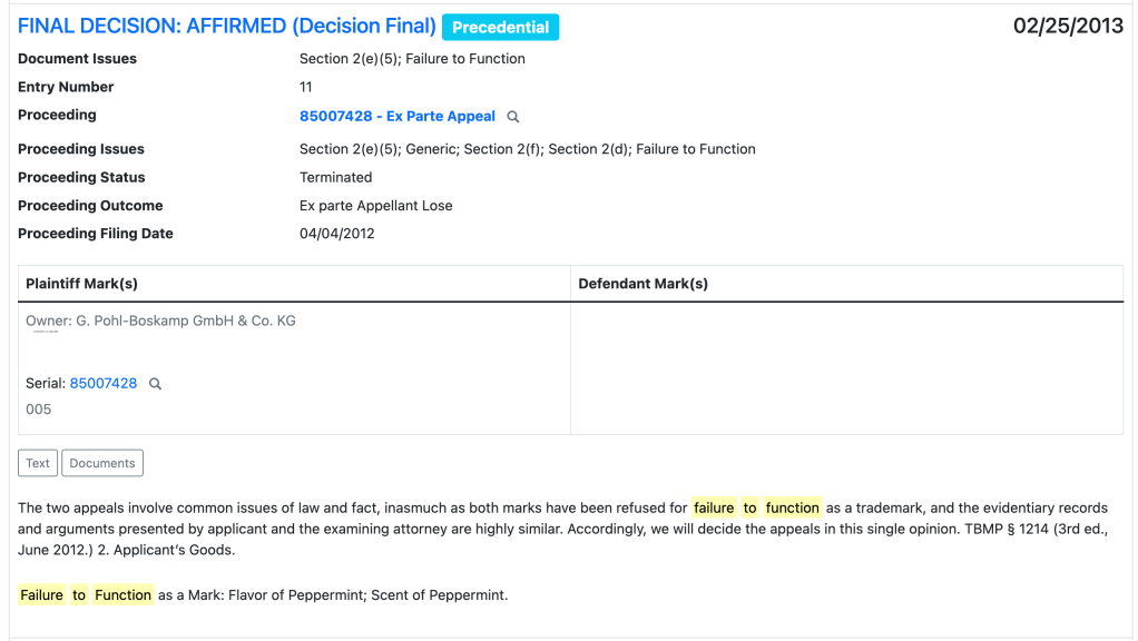
Find briefs that have been effective on your specific issue, or free-text search to find how other lawyers are effectively citing to a specific case or building a particular style of argument. For example, you can search for appeal decisions relating to “failure to function” refusals, and then sort by precedential decisions.
Clearance
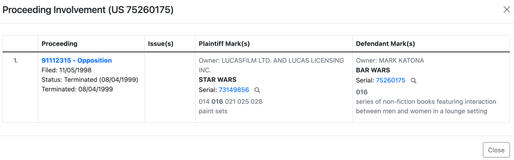
Clearance reports now embed valuable opposition, cancellation, and appeal data. You can now identify aggressive potential opposers without further research. Where applicable, you will see a “Proceedings” line in the Mark field of your manual or automated search results, as below.
Click in to quickly see more details about the proceeding in question via a popup. If you need to dig further, just click on the link to the proceeding number to go to the full details page.
Get researching!
Try it today! We’d love to hear what you think, and when you have been able to make use of the new TTAB research tools to improve your client outcomes. And, of course, make sure to mention this to your litigation-focused colleagues who may not have used TM TKO before.
TM TKO is proud to announce a sweeping new round of innovations in its automated, in-depth clearance tool. These improvements focus on goods-and-services comparisons.
First, we have added an entirely new way of comparing key concepts between different types of products and services. Driven by leading-edge artificial intelligence, these comparisons better cut through the noise to highlight risks across classes.
Second, there is a dramatically improved classifier. In the enhanced goods and services selector tool, you will see class information and whether the description is in the USPTO’s Trademark ID Manual, helping you select the best and most accurate set of descriptions for your search.
You will see benefits from the new classifier in substantive search outcomes, too. Newly filed applications with incorrect classifications will take into account both the applicant-assigned class and the “correct” class from the classifier, upping scoring accuracy and search quality on even accidentally or intentionally misfiled applications. You will see similar benefits in the scoring of older registrations where the “correct” classification for the relevant goods or services has changed since the registration date.
How will these changes impact the appearance of your report? The most conceptually-related goods or services will score substantially higher than before in the table of most reports. You will also see these results visualized further to the right in your results scatterplot.
Finally, we are retiring the “retail” and “software” tabs in the goods-and-services selector for the Knockout tool. Now, a search for a mark for services like “retail shoe store services” will do an excellent job highlighting related products and services without the need for either the old retail tab or putting in multiple descriptions of goods or services. We have already updated existing searches and watches that used those tabs to appropriately take advantage of the new methodology; you won’t need to do anything.
We’re thrilled to have these improvements integrated into our system, and hope you find them as exciting as we do!
TM TKO has made a number of updates and improvements to to our user interface over recents weeks, and we thought a summary blog post was warranted to summarize all the changes!
Tracking improvements
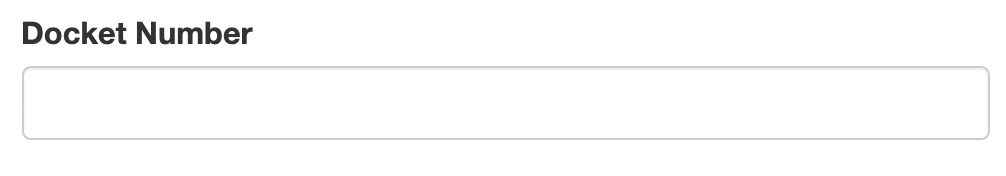
Across all searches, we’ve added a “Docket Number” field. You can also find this in your History window, making it easy to keep track of — and get back to — prior projects.
Search tagging and commenting
In all searches, we have made a number of improvements to make it easier to tag and comment on results. The first column of your results now has more going on than it used to. The first row has a number and a pair of arrows; these let you move around in the report and control its functions. The second row has expanded tagging functionality and a new notes feature.
The number in the upper-left is now an active link. Click on it, and we’ll bounce you up to the scatterplot to see where this application or registration record is located.
The paired arrows in the upper right will compress the contents of that row to a single line, or expand it again. It’s useful for shortening up lengthy descriptions of goods and services.
The tagging star is not new, but some of its functionality is. When you click on the star, it won’t immediately turn blue like it used to. Instead, you’ll get a popup with several color options: red, yellow, green, blue, and clear. This will let you prioritize and re-sort results how you want them, both inside the platform and in exports. (More on the export side shortly.) All of your old searches with blue stars will still appear blue, but you can edit those to use the new colors.
After you pick a star, you can double-click to apply that same star color to any other rows. Pick a new color from the color selector, and double-clicking will apply that new color.
The little pencil-writing-on-paper icon in the lower right allows you to add and edit notes on a per-record basis. Click on one, and you’ll get an interstitial pop-up to add your comments: comments about the risk analysis, a link to the mark in use, or etc. In the platform, you can read the comment by clicking on the icon — you’ll see a darker icon for any rows that have user comments.
Where the comments show up in exports varies a bit. For Word and PDF exports, they show up in a row immediately below the commented-upon record. Some comments can be pretty long, and this makes sure your insights won’t be squashed into a tiny little column. For CSV exports, they’ll be the furthest-right column, but on the same row.
Search report spacing and review
The small “paired arrows” in the bottom right show up in several places in the interface. They do the same thing: give you a “compressed” view of results. If you click on it on a single line, it’ll shorten that up to just the core details. You might use it to, say, skim over a 44(e) registration with a list of goods that goes on and on and on and on. Here’s what a shortened row looks like:
If you click the two-arrow icon on the top of a search or a section of a search, it’ll single-line all records. It’s just like the per-row expander, but applied to the whole section of the report. If you click the four-arrow expander icon, for either the whole report or just a section, the rows will expand to the full width of your window with no whitespace buffer.
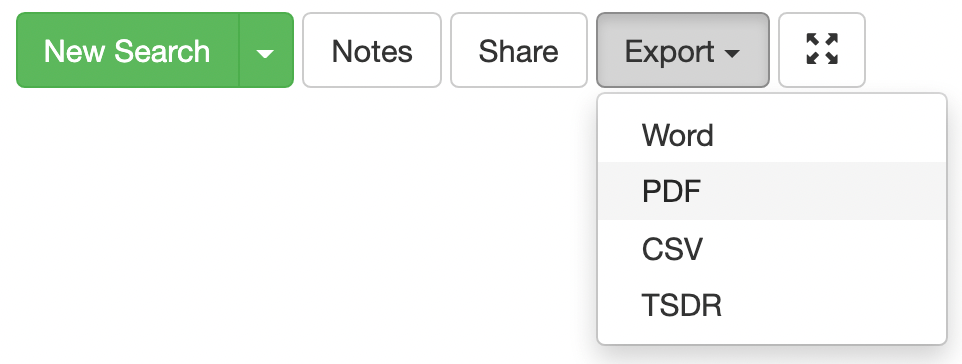
Search export
The export buttons have moved from specific sections to a unified export button at the top right of the page, as shown below.
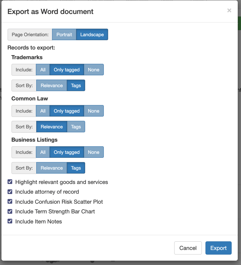
When you click on an export type, you’ll get a much more detailed set of options than before. You now have more optionality about both what results to include by section (all, only tagged, or none) and about the order they will appear (sorting by relevance or tags). If you sort by tags, you’ll get results in order, with red first then yellow, green, blue, and clear (untagged). This should allow you to get your charts ordered exactly how you want them with less effort.
At the bottom, you’ll see some extra checkboxes — you can choose whether to include static images of the scatterplot and bar graphs (previously available in PDF and now available in Word, too), and whether to include item-specific notes.
Bulk Search
Users with heavy clearance needs have requested a way to enter bulk searches. For example, clothing brands may need to clear hundreds of names for a new seasons’ catalog, or pharma brands may need to get a long list of candidate names to submit for regulatory approval. We have just added a feature to facilitate these clearances.
The new Bulk Order page under Knockout is where you can take advantage of this new convenience. It’s simple to order multiple searches for different marks using the same goods, whether word marks or designs, and you can even input names via spreadsheet. Bulk searches are no less thorough than a normal search, and you can go into each search report individually. To facilitate quick review, bulk orders also have a convenient preview page that summarizes all the results. It provides you a quick risk assessment (using the red/yellow/green stars; these are user-editable so you can customize the assessment) and a short preview of the top handful of results. It’s a huge time saver! To reflect the additional computational impact of turning around large numbers of results quickly, bulk orders have a $5 fee per marked searched.
Thanks!
Your feedback and suggestions are really important to TM TKO — they help inform how and when we make updates to our services. We hope that you will enjoy these upgrades, and keep the suggestions coming!